The index page links to the Chinese version and English version. To show the features of each of them, the image link to the Chinese version uses one Chinese calligraphy work as its background, and the image link to the English version displays the letters of the word "English" in some peculiar font style, that is, Chinese clerical script. So the main job in making the main page is the font design of the several letters in "English". METAFONT is now of use and I did the job by learning simultaneously.
Beginning from Christophe Grandsire's The METAFONT tutorial(mftut.pdf) (which is linked in the "Metafont" entry of wikipedia), the first example in it is:
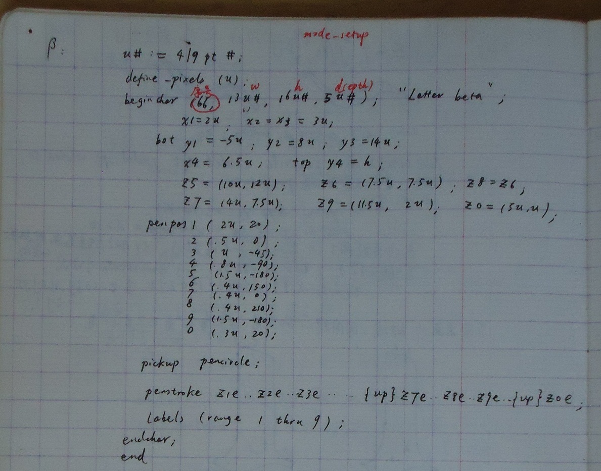
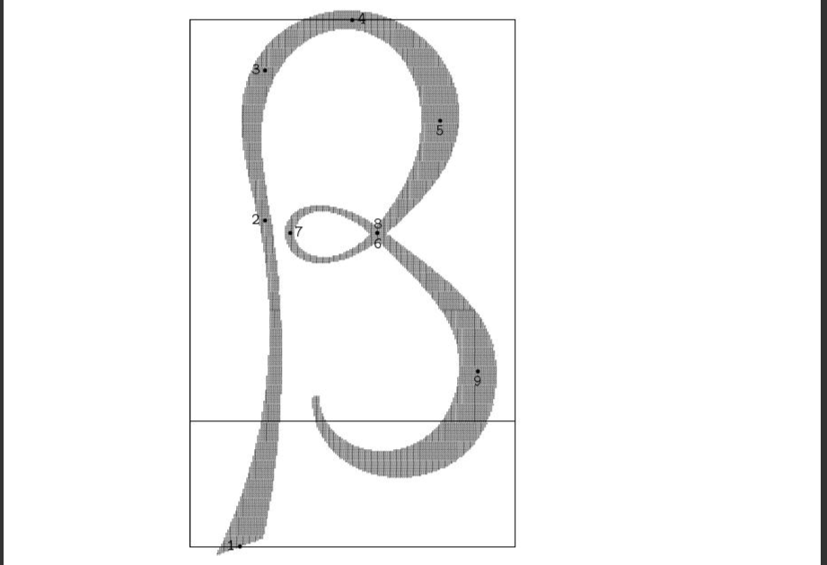
This produces a letter 'beta';
Continually I learned some more instructions that I thought maybe would be used. Here they are listed:
Those letters that include strokes which most embody the clerical script style are letter 'E' and 'g'. But the pattern used most
is the serif at the beginning and the end of the strokes. So I learned some drawing methods for the serifs rather in detail,
excerpting and translating( into Chinese) some contents about drawing serifs in the book The METAFONTbook.
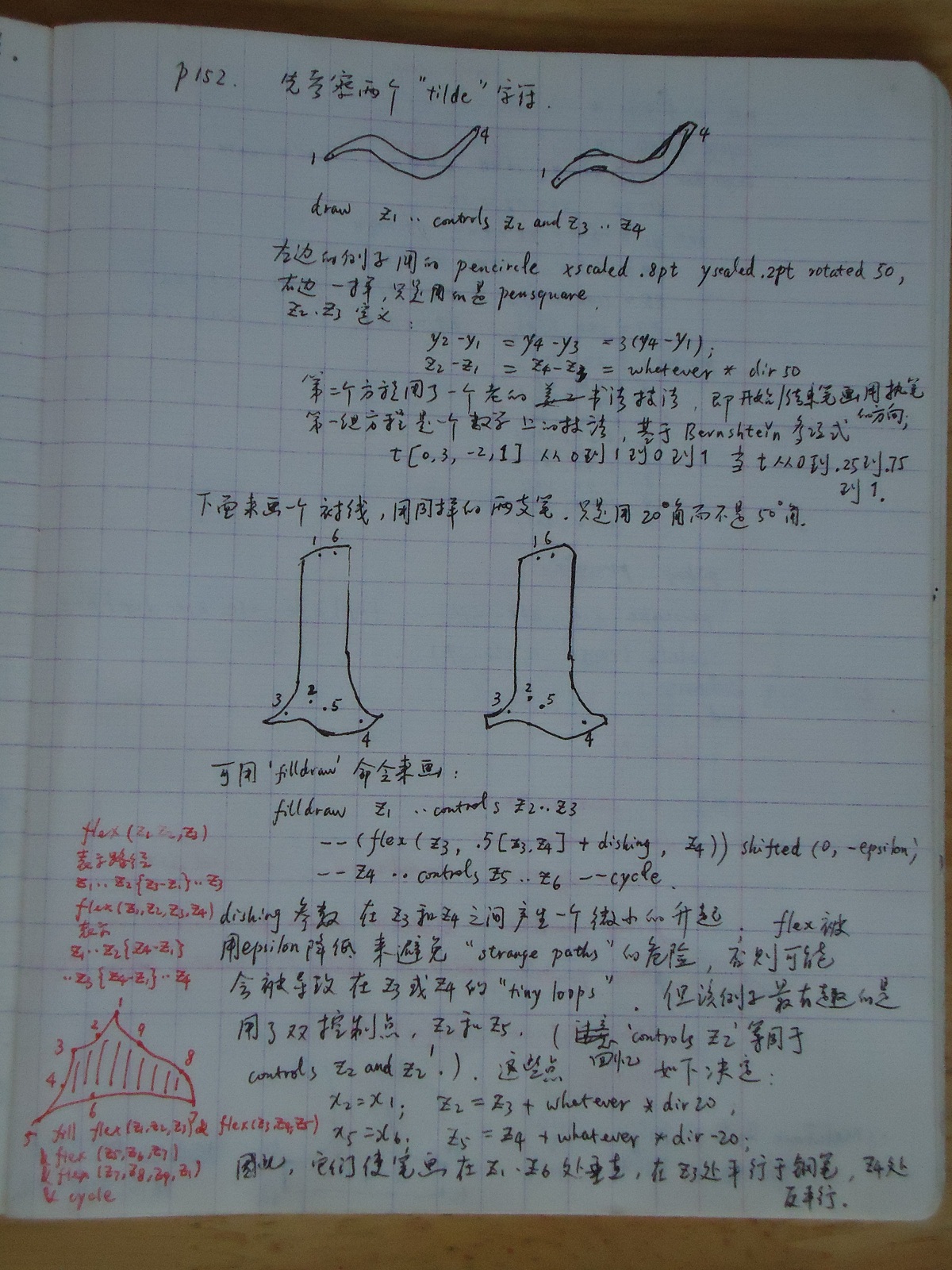
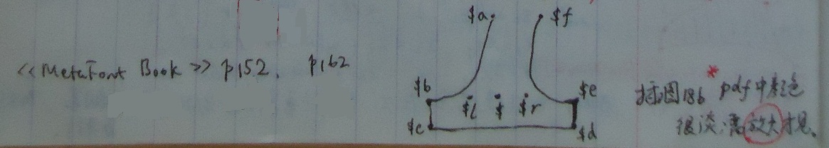
The book first talked about drawing serif at one place on page 152. Then it discussed the methods for drawing serifs in detail since page 162.
On page 152, the book wrote:
"
......First, let's examine two "tilde" characters (Figure 16f&g) which were both created by a single command of the form
draw @z_1@ .. controls @z_2@ and @z_3@ .. @z_4@.
The left example was done with a pencircle xscaled .8pt yscaled .2pt rotated 50, and the right example was exactly the same but with pensquare. The control points @z_2@ and @z_3@ that made this work were defined by
@y_2@ - @y_1@ = @y_4@ - @y_3@ = 3(@y_4@ - @y_1@);
@z_2@ - @z_1@ = @z_4@ - @z_3@ = whatever * dir 50.
The second pair of equations is an old calligrapher's trick, namely to start and finish a stroke in the direction of the pen you're holding. The first pair of equations is a mathematician's trick, based on the fact that the Bernshtein polynomial t[0,3,-2,1] goes from 0 to 1 to 0 to 1 as t goes from 0 to .25 to .75 to 1.
Next, let's try to draw a fancy serif with the same two pens, holding them at a 20° angle instead of a 50° angle. Here are two examples (Figure 16h&i) that can be created by 'filldraw' commands:
filldraw @z_1@ .. controls @z_2@ .. @z_3@
--(flex(@z_3@, .5[@z_3@,@z_4@] + dishing, @z_4@)) shifted(0, -epsilon)
-- @z_4@ .. controls @z_5@ .. @z_6@ -- cycle.
The dishing parameter causes a slight rise between @z_3@ and @z_4@; the flex has been lowered by epsilon in order to avoid the danger of "strange paths," which might otherwise be caused by tiny loops at @z_3@ or @z_4@. But the most interesting thing about this example is the use of double control points, @z_2@ and @z_5@, in two of the path segments. (Recall that 'controls @z_2@' means the same thing as 'controls @z_2@ and @z_2@'.) These points were determined by the equations
@x_2@ = @x_1@; @z_2@ = @z_3@ + whatever * dir 20;
@x_5@ = @x_6@; @z_5@ = @z_4@ + whatever * dir -20;
thus, they make the strokes vertical at @z_1@ and @z_6@, parallel to the pen angle at @z_3@, and parallel to the complementary angle at @z_4@.
"
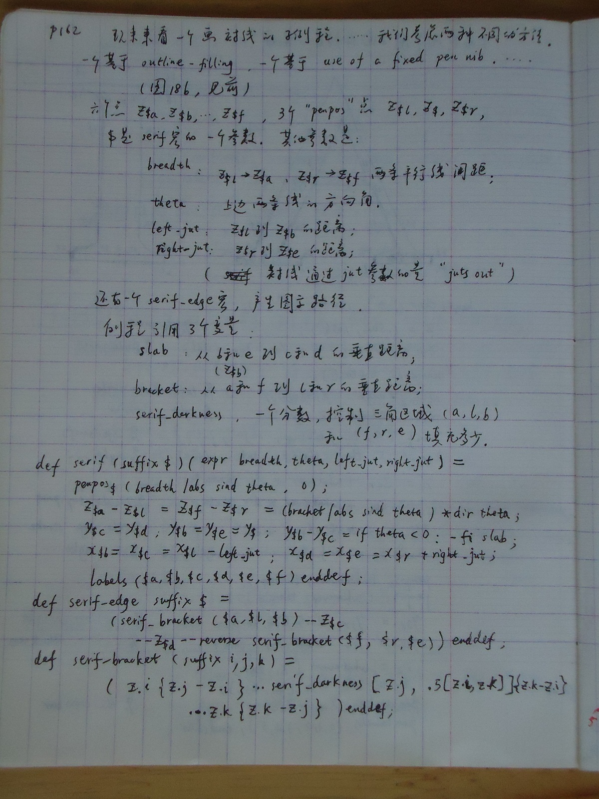
Now come to the place on page 162:
The book introduces two different methods successively.
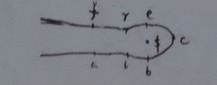
Figure 18b(below) gives one form of serif to be drawn( using the first method):
Then the author begins to illustrate them.
On page 162, the book wrote:
"
Let's look now at a subroutine for drawing serifs, ......We shall consider two rather different approaches, one based on
outline-filling and the other based on the use of a fixed pen nib. ......
(Figure 18b)
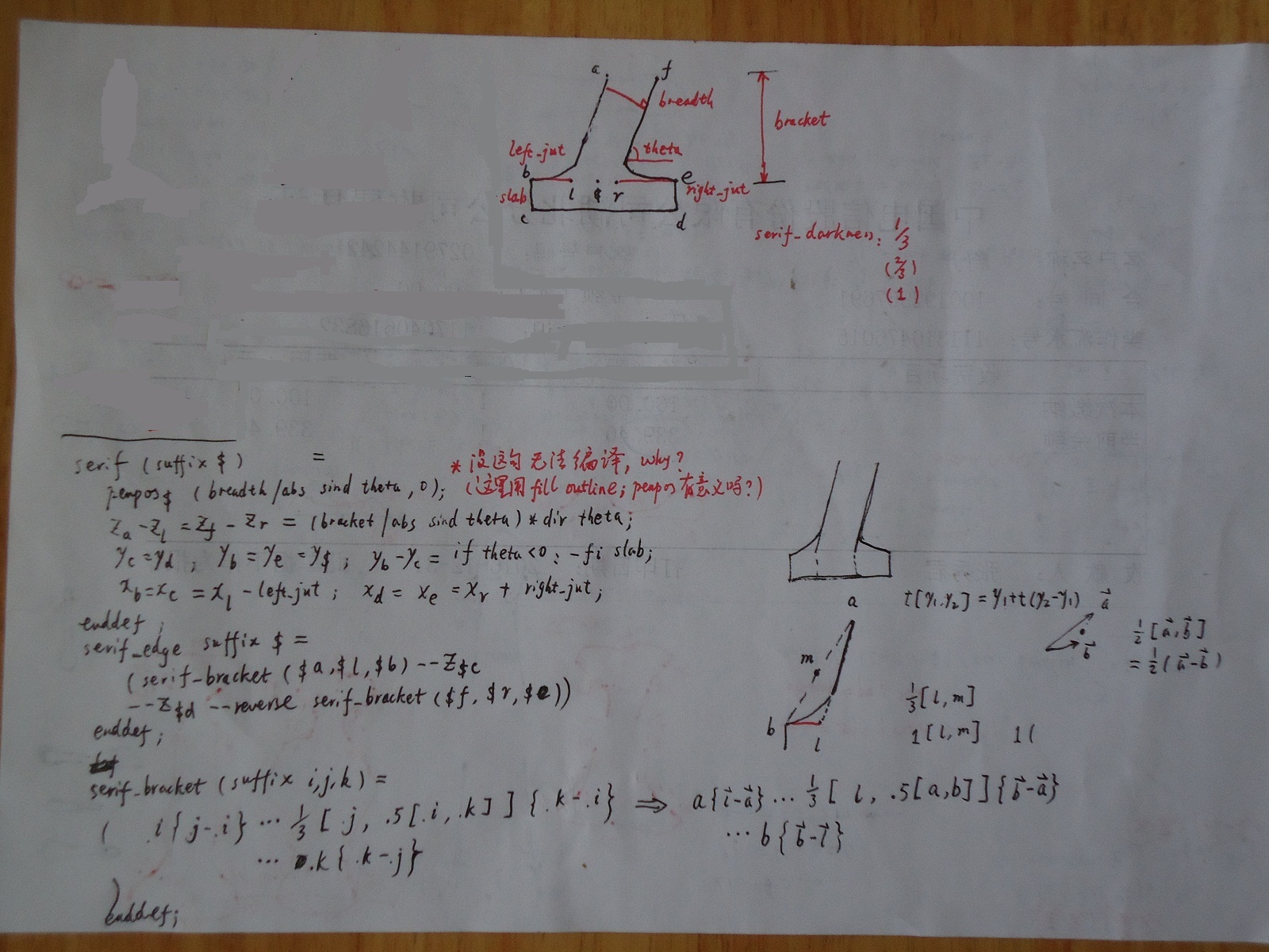
Our first example is a serif routine that constructs six points @z_{$a}@, @z_{$b}@, ..., @z_{$f}@ around a given triple of "penpos" points @z_{$l}@, @z_{$}@, @z_{$r}@; here $ is a suffix that's a parameter to the serif macro. Other parameters are: breadth, the distance between the parallel lines that run from @z_{$l}@ to @z_{$a}@ and from @z_{$r}@ to @z_{$f}@; theta, the direction angle of those two lines; left_jut, the distance from @z_{$l}@ to @z_{$b}@; and right_jut, the distance from @z_{$r}@ to @z_{$e}@. (The serif "juts out" by the amounts of the jut parameters.) There is also a serif_edge macro, which constructs the path shown. The routines refer to three variables that are assumed to apply to all serifs: slab, the vertical distance from @z_{$b}@ and @z_{$e}@ to @z_{$c}@ and @z_{$d}@; bracket, the vertical distance from @z_{$a}@ and @z_{$f}@ to @z_{$l}@ and @z_{$r}@; and serif_darkness, a fraction that controls how much of the triangular regions (@z_{$a}@, @z_{$l}@, @z_{$b}@) and (@z_{$f}@, @z_{$r}@, @z_{$e}@) will be filled in.
def serif (suffix $)(expr breadth, theta, left_jut, right_jut ) =
penpos@_$@(breadth / abs sind theta, 0);
@z_{$a}@ - @z_{$l}@ = @z_{$f}@ - @z_{$r}@ = (bracket / abs sind theta * dir theta);
@y_{$c}@ = @y_{$d}@; @y_{$b}@ = @y_{$e}@ = @y_{$}@; @y_{$b}@ - @y_{$c}@ = if theta < 0 : - fi slab;
@x_{$b}@ = @x_{$c}@ = @x_{$l}@ - left_jut; @x_{$d}@ = @x_{$e}@ = @x_{$r}@ + right_jut;
labels($a,$b,$c,$d,$e,$f) enddef;
def serif_edge suffix $ =
(serif_bracket($a,$l,$b) -- @z_{$c}@
-- @z_{$d}@ -- reverse serif_bracket($f,$r,$e)) enddef;
def serif_bracket(suffix i, j, k) =
(@z@.i{@z@.j - @z@.i} ... serif_darkness[@z@.j, .5[@z@.i, @z@.k]]{@z@.k - @z@.i}
... @z@.k{@z@.k - @z@.j}) enddef;
"
(Figure 18b)
Our first example is a serif routine that constructs six points @z_{$a}@, @z_{$b}@, ..., @z_{$f}@ around a given triple of "penpos" points @z_{$l}@, @z_{$}@, @z_{$r}@; here $ is a suffix that's a parameter to the serif macro. Other parameters are: breadth, the distance between the parallel lines that run from @z_{$l}@ to @z_{$a}@ and from @z_{$r}@ to @z_{$f}@; theta, the direction angle of those two lines; left_jut, the distance from @z_{$l}@ to @z_{$b}@; and right_jut, the distance from @z_{$r}@ to @z_{$e}@. (The serif "juts out" by the amounts of the jut parameters.) There is also a serif_edge macro, which constructs the path shown. The routines refer to three variables that are assumed to apply to all serifs: slab, the vertical distance from @z_{$b}@ and @z_{$e}@ to @z_{$c}@ and @z_{$d}@; bracket, the vertical distance from @z_{$a}@ and @z_{$f}@ to @z_{$l}@ and @z_{$r}@; and serif_darkness, a fraction that controls how much of the triangular regions (@z_{$a}@, @z_{$l}@, @z_{$b}@) and (@z_{$f}@, @z_{$r}@, @z_{$e}@) will be filled in.
def serif (suffix $)(expr breadth, theta, left_jut, right_jut ) =
penpos@_$@(breadth / abs sind theta, 0);
@z_{$a}@ - @z_{$l}@ = @z_{$f}@ - @z_{$r}@ = (bracket / abs sind theta * dir theta);
@y_{$c}@ = @y_{$d}@; @y_{$b}@ = @y_{$e}@ = @y_{$}@; @y_{$b}@ - @y_{$c}@ = if theta < 0 : - fi slab;
@x_{$b}@ = @x_{$c}@ = @x_{$l}@ - left_jut; @x_{$d}@ = @x_{$e}@ = @x_{$r}@ + right_jut;
labels($a,$b,$c,$d,$e,$f) enddef;
def serif_edge suffix $ =
(serif_bracket($a,$l,$b) -- @z_{$c}@
-- @z_{$d}@ -- reverse serif_bracket($f,$r,$e)) enddef;
def serif_bracket(suffix i, j, k) =
(@z@.i{@z@.j - @z@.i} ... serif_darkness[@z@.j, .5[@z@.i, @z@.k]]{@z@.k - @z@.i}
... @z@.k{@z@.k - @z@.j}) enddef;
"
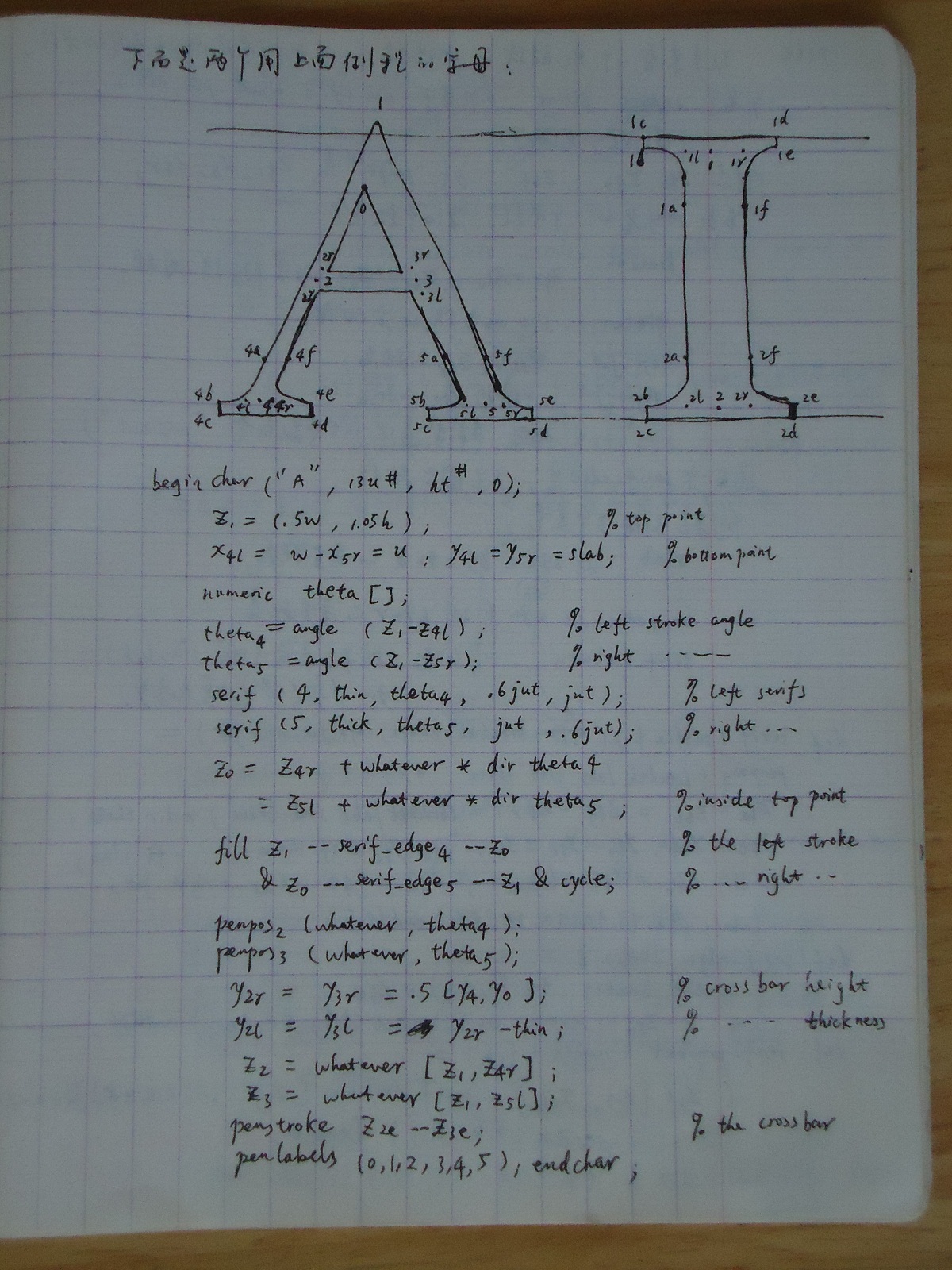
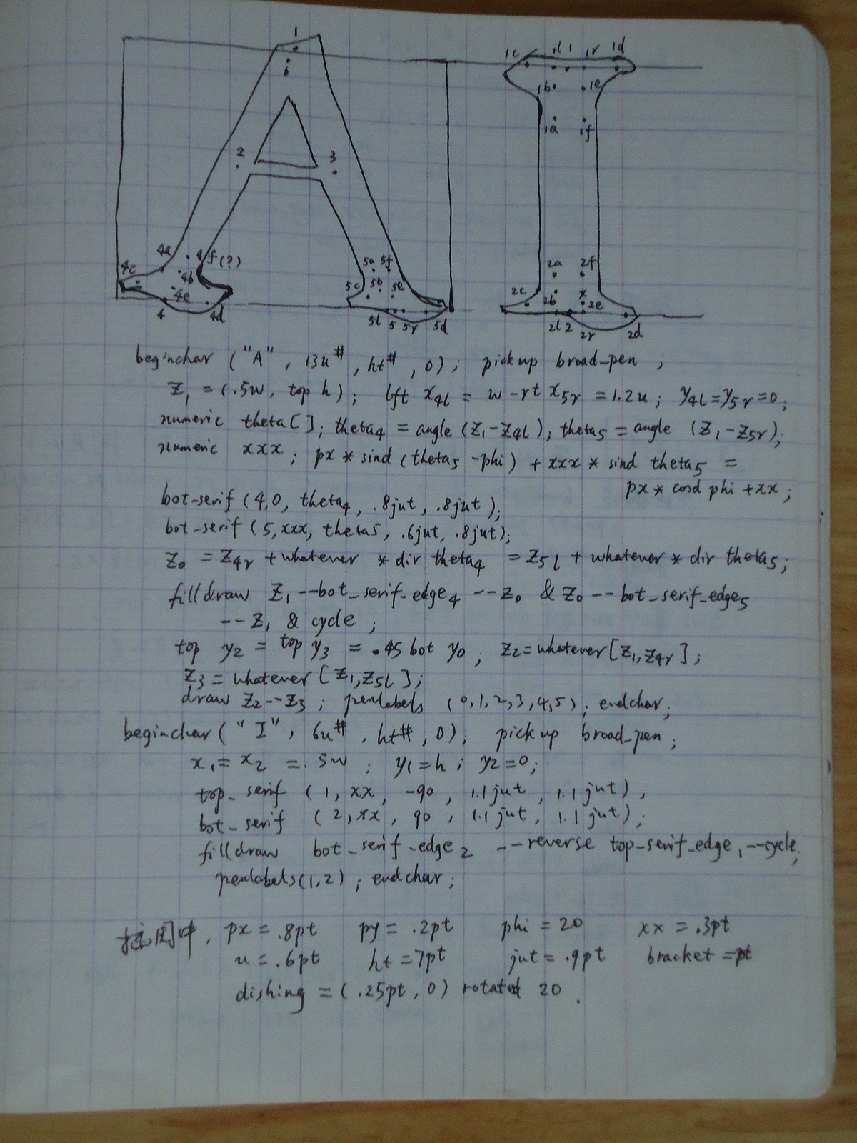
On page 163, the author drew the letter 'A' and 'I' with such kind of serif using the above routines. The book wrote:
"
(Figure 18c)
beginchar("A", 13u#, ht#, 0);
@z_1@ = (.5w, 1.05h);
@x_{4l}@ = w - @x_{5r}@ = u; @y_{4l}@ = @y_{5r}@ = slab;
numeric theta[];
theta@_4@ = angle(@z_1@ - @z_{4l}@);
theta@_5@ = angle(@z_1@ - @z_{5r}@);
serif(4, thin, theta@_4@, .6jut, jut);
serif(5, thick,theta@_5@, jut, .6jut);
@z_0@ = @z_{4r}@ + whatever * dir theta@_4@
= @z_{5l}@ + whatever * dir theta@_5@;
fill @z_1@ -- serif_edge@_4@ -- @z_0@
& @z_0@ -- serif_edge@_5@ -- @z_1@ & cycle;
penpos@_2@(whatever, theta@_4@);
penpos@_3@(whatever, theta@_5@);
@y_{2r}@ = @y_{3r}@ = .5[@y_4@, @y_0@];
@y_{2l}@= @y_{3l}@ = @y_{2r}@ - thin;
@z_2@ = whatever[@z_1@, @z_{4r}@];
@z_3@ = whatever[@z_1@, @z_{5l}@];
penstroke @z_{2e}@ -- @z_{3e}@;
penlabels(0,1,2,3,4,5); endchar;
beginchar("I", 6u#, ht#, 0);
@x_1@ = @x_2@ = .5w;
@y_1@ = h - @y_2@; @y_2@ = slab;
serif(1, thick, -90, 1.1jut, 1.1jut);
serif(2, thick, 90, 1.1jut, 1.1jut);
fill serif_edge@_2@ -- reverse serif_edge@_1@ -- cycle;
penlabels(1,2); endchar;
The illustration was prepared with thin = .5pt, thick = 1.1pt, u = .6pt, ht = 7pt, slab = .25pt, jut = .9pt, bracket = pt, and serif_darkness = 1/3.
"
On page 164, the author continues to explain the second method and gives letter 'A' and 'I' examples with another kind of serif.
The book wrote:
"
A second approach to serifs can be based on the example at the end of Chapter 16.@^\dagger@ In this case we assume that broad_pen
is a 'pensquare xscaled px yscaled py rotated phi ' for some px > py and some small angle phi. Thicker strokes will be
made by using this pen to fill a larger regiion; the serif routine is given the distance xx between @z_{$l}@ and @z_{$r}@. There's a
pair variable called dishing that controls the curvature between @z_{$c}@ and @z_{$d}@. Top and bottom serifs are similar, but they
are sufficiently different that it's easier to write seperate macros for each case.
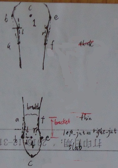
def bot_serif(suffix $)(expr xx,theta,left_jut,right_jut) =
penpos@_$@(xx,0); @z_{$a}@ - @z_{$l}@ = @z_{$f}@ - @z_{$r}@ = (bracket / abs sind theta) * dir theta;
@y_{$c}@ = top @y_{$l}@; @y_{$d}@ = @y_{$r}@; @x_{$c}@ = @x_{$l}@ - left_jut; @x_{$d}@ = @x_{$r}@ + right_jut;
@z_{$b}@ = @z_{$l}@ + whatever * dir theta = @z_{$c}@ + whatever * dir phi;
@z_{$e}@ = @z_{$r}@ + whatever * dir theta = @z_{$d}@ + whatever * dir -phi;
labels($a,$b,$c,$d,$e,$f) enddef;
def bot_serif_edge suffix $ =
(@z_{$a}@ .. controls @z_{$b}@ .. @z_{$c}@
-- (flex(@z_{$c}@, .5[@z_{$c}@, @z_{$d}@] + dishing, @z_{$d}@)) shifted (0, -epsilon)
-- @z_{$d}@ .. controls @z_{$e}@ .. @z_{$f}@) enddef;
(Figure 18d)
beginchar("A", 13u#, ht#, 0); pickup broad_pen;
@z_1@ = (.5w, top h); lft @x_{4l}@ = w - rt @x_{5r}@ = 1.2u; @y_{4l}@ = @y_{5r}@ = 0;
numeric theta[]; theta@_4@ = angle(@z_1@ - @z_{4l}@); theta@_5@ = angle(@z_1@ - @z_{5r}@);
numeric xxx; px * sind(theta@_5@ - phi) + xxx * sind theta@_5@ = px * cosd phi + xx;
bot_serif(4, 0, theta@_4@, .8jut, .8jut); bot_serif(5, xxx, theta@_5@, .6jut, .8jut);
@z_0@ = @z_{4r}@ +whatever * dir theta@_4@ = @z_{5l}@ + whatever * dir theta@_5@;
filldraw @z_1@ -- bot_serif_edge@_4@ -- @z_0@ & @z_0@ -- bot_serif_edge@_5@ -- @z_1@ & cycle;
top @y_2@ = top @y_3@ = .45bot @y_0@; @z_2@ = whatever[@z_1@,@z_{4r}@]; @z_3@ = whatever[@z_1@,@z_{5l}@];
draw @z_2@ -- @z_3@; penlabels(0,1,2,3,4,5); endchar;
beginchar("I", 6u#, ht#, 0); pickup broad_pen;
@x_1@ = @x_2@ = .5w; @y_1@ = h; @y_2@ = 0;
top_serif(1, xx, -90, 1.1jut, 1.1jut); bot_serif(2, xx, 90, 1.1jut, 1.1jut);
filldraw bot_serif_edge@_2@ -- reverse top_serif_edge@_1@ -- cycle;
penlabels(1,2); endchar;
In the illustration, px = .8pt, py = .2pt, phi = 20, xx = .3pt, u = .6pt, ht = 7pt, jut = .9pt, bracket = pt, and dishing = (.25pt, 0) rotated 20.
"
@\dagger@: The said "example at the end of Chapter 16" in the above text means the contents on page 152 that were quoted above.
def bot_serif(suffix $)(expr xx,theta,left_jut,right_jut) =
penpos@_$@(xx,0); @z_{$a}@ - @z_{$l}@ = @z_{$f}@ - @z_{$r}@ = (bracket / abs sind theta) * dir theta;
@y_{$c}@ = top @y_{$l}@; @y_{$d}@ = @y_{$r}@; @x_{$c}@ = @x_{$l}@ - left_jut; @x_{$d}@ = @x_{$r}@ + right_jut;
@z_{$b}@ = @z_{$l}@ + whatever * dir theta = @z_{$c}@ + whatever * dir phi;
@z_{$e}@ = @z_{$r}@ + whatever * dir theta = @z_{$d}@ + whatever * dir -phi;
labels($a,$b,$c,$d,$e,$f) enddef;
def bot_serif_edge suffix $ =
(@z_{$a}@ .. controls @z_{$b}@ .. @z_{$c}@
-- (flex(@z_{$c}@, .5[@z_{$c}@, @z_{$d}@] + dishing, @z_{$d}@)) shifted (0, -epsilon)
-- @z_{$d}@ .. controls @z_{$e}@ .. @z_{$f}@) enddef;
(Figure 18d)
beginchar("A", 13u#, ht#, 0); pickup broad_pen;
@z_1@ = (.5w, top h); lft @x_{4l}@ = w - rt @x_{5r}@ = 1.2u; @y_{4l}@ = @y_{5r}@ = 0;
numeric theta[]; theta@_4@ = angle(@z_1@ - @z_{4l}@); theta@_5@ = angle(@z_1@ - @z_{5r}@);
numeric xxx; px * sind(theta@_5@ - phi) + xxx * sind theta@_5@ = px * cosd phi + xx;
bot_serif(4, 0, theta@_4@, .8jut, .8jut); bot_serif(5, xxx, theta@_5@, .6jut, .8jut);
@z_0@ = @z_{4r}@ +whatever * dir theta@_4@ = @z_{5l}@ + whatever * dir theta@_5@;
filldraw @z_1@ -- bot_serif_edge@_4@ -- @z_0@ & @z_0@ -- bot_serif_edge@_5@ -- @z_1@ & cycle;
top @y_2@ = top @y_3@ = .45bot @y_0@; @z_2@ = whatever[@z_1@,@z_{4r}@]; @z_3@ = whatever[@z_1@,@z_{5l}@];
draw @z_2@ -- @z_3@; penlabels(0,1,2,3,4,5); endchar;
beginchar("I", 6u#, ht#, 0); pickup broad_pen;
@x_1@ = @x_2@ = .5w; @y_1@ = h; @y_2@ = 0;
top_serif(1, xx, -90, 1.1jut, 1.1jut); bot_serif(2, xx, 90, 1.1jut, 1.1jut);
filldraw bot_serif_edge@_2@ -- reverse top_serif_edge@_1@ -- cycle;
penlabels(1,2); endchar;
In the illustration, px = .8pt, py = .2pt, phi = 20, xx = .3pt, u = .6pt, ht = 7pt, jut = .9pt, bracket = pt, and dishing = (.25pt, 0) rotated 20.
"
The first method based on outline-filling(using fill instruction) is easier to understand for me so I used it to draw serifs. I basically inherited the macros and routines inside the original book and they were usable after a few modifications.
First I did some working for understanding the routines in the author's original book:
Then I wanted to draw roughly like this:
That is, the parts at the beginning and the end of the stroke are a bit thicker. The above shows a vertical stroke, it is the same
for a horizontal stroke. Below is the draft for setting points of the outline.
It just got one less point(point d) than the original book.
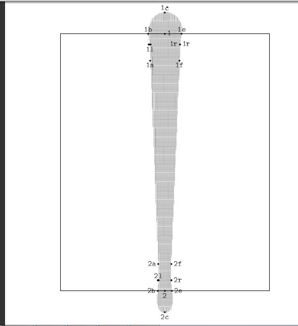
The best example of a vertical stroke implementation is the letter 'l':
tmp5\lowerL.mf:
It got one more parameter breadth_out than the original macro in the book because the breadths of the two ends of the stroke are
different, so this is used to stand for the breadth of the other end(is thick or is thin).
u#:=.6pt#;
thin#:=.5pt#;
thick#:=1.1pt#;
ht#:=7pt#;
%slab#:=.25pt#;
slab#:=.8pt#;
%jut#:=.9pt#;
jut#:=.3pt#;
bracket#:=pt#;
define_pixels(u, ht, slab, jut, bracket);
define_blacker_pixels(thin, thick);

def serif_my(suffix $)(expr breadth, breadth_out, theta, left_jut, right_jut) =
 %penpos$(breadth / abs sind theta, 0);
  x$a = x$ - 0.5breadth;
  x$f = x$ + 0.5breadth;
  y$a = y$f = y$+bracket*(sind theta);

  x$b = x$ - left_jut ;
  x$e = x$ + right_jut;
  y$b = y$e = y$;

  x$c = x$;
  y$c = y$ - slab * sind theta;

  y$l = 0.4[y$b, y$a];
  y$r = 0.4[y$e, y$f];

  z$m = 0.4[z$b, z$a];
  y$n - y$b = 0.4(y$a - y$b);
  x$n-x$a = (0.5*(breadth_out-breadth))*(0.6*(y$a-y$b)) / (y1-y2);

  z$l = 0.5[z$m, z$n];
  x$r = x$ + x$ - x$l;
labels($a,$b,$c,$e,$f,$l,$r, $m, $n)
enddef;


def serif_edge_my suffix $ =
  (z$a{z$l-z$a}..z$l{z$b-z$l}...z$b..z$c..z$e{z$r-z$e}...z$r{z$f-z$r}..z$f)
enddef;


beginchar("l",13u#,16u#,0);"Letter l";

x1=x2=.5w;
y1=h;y2=0;

serif_my(1, thick,thin,  -90, 2.1jut, 2.1jut);
serif_my(2, thin, thick,  90, 0.9jut, 0.9jut);

fill serif_edge_my2 -- reverse serif_edge_my1 -- cycle;

penlabels(1,2);
endchar;
end
For the horizontal stroke of the letter, I found that I only need to change the angles in the routine code that calls the macro and change the coordinate 'x' to a corresponding 'y' in the macro. The letter 'i' is designed to be a vertical stroke under a dot which is implemented as a short horizontal stroke. Compared to the letter 'l', it just got one more horizontal stroke. So I take it as an example here, its code is as below:
tmp5\lowerI.mf:
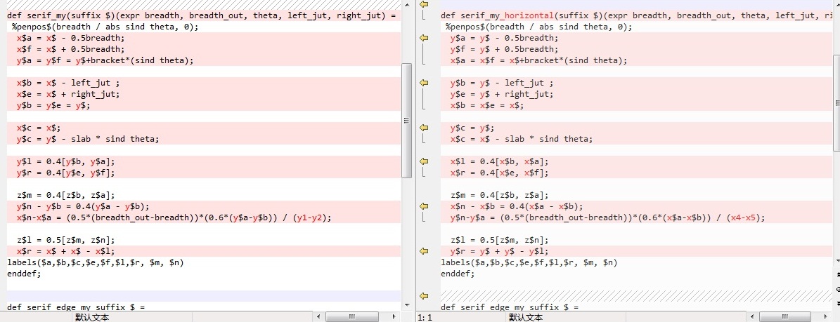
It can be seen that the serif_my macro doesn't change any. The change in serif_my_horizontal macro compared to the
serif_my macro is as below picture:
u#:=.6pt#;
thin#:=.5pt#;
thick#:=1.1pt#;
ht#:=7pt#;
%slab#:=.25pt#;
slab#:=.8pt#;
%jut#:=.9pt#;
jut#:=.3pt#;
bracket#:=pt#;
define_pixels(u, ht, slab, jut, bracket);
define_blacker_pixels(thin, thick);

def serif_my(suffix $)(expr breadth, breadth_out, theta, left_jut, right_jut) =
 %penpos$(breadth / abs sind theta, 0);
  x$a = x$ - 0.5breadth;
  x$f = x$ + 0.5breadth;
  y$a = y$f = y$+bracket*(sind theta);

  x$b = x$ - left_jut ;
  x$e = x$ + right_jut;
  y$b = y$e = y$;

  x$c = x$;
  y$c = y$ - slab * sind theta;

  y$l = 0.4[y$b, y$a];
  y$r = 0.4[y$e, y$f];

  z$m = 0.4[z$b, z$a];
  y$n - y$b = 0.4(y$a - y$b);
  x$n-x$a = (0.5*(breadth_out-breadth))*(0.6*(y$a-y$b)) / (y1-y2);

  z$l = 0.5[z$m, z$n];
  x$r = x$ + x$ - x$l;
labels($a,$b,$c,$e,$f,$l,$r, $m, $n)
enddef;

def serif_my_horizontal(suffix $)(expr breadth, breadth_out, theta, left_jut, right_jut) =
 %penpos$(breadth / abs sind theta, 0);
  y$a = y$ - 0.5breadth;
  y$f = y$ + 0.5breadth;
  x$a = x$f = x$+bracket*(sind theta);

  y$b = y$ - left_jut ;
  y$e = y$ + right_jut;
  x$b = x$e = x$;

  y$c = y$;
  x$c = x$ - slab * sind theta;

  x$l = 0.4[x$b, x$a];
  x$r = 0.4[x$e, x$f];

  z$m = 0.4[z$b, z$a];
  x$n - x$b = 0.4(x$a - x$b);
  y$n-y$a = (0.5*(breadth_out-breadth))*(0.6*(x$a-x$b)) / (x4-x5);

  z$l = 0.5[z$m, z$n];
  y$r = y$ + y$ - y$l;
labels($a,$b,$c,$e,$f,$l,$r, $m, $n)
enddef;

def serif_edge_my suffix $ =
  (z$a{z$l-z$a}..z$l{z$b-z$l}...z$b..z$c..z$e{z$r-z$e}...z$r{z$f-z$r}..z$f)
enddef;


beginchar("i",13u#,16u#,0);"Letter i";

x1=x2=.5w;
y1=h/2;y2=0;


serif_my(1, thick,thin,  -90, 2.1jut, 2.1jut);
serif_my(2, thin, thick,  90, 0.9jut, 0.9jut);
fill serif_edge_my2 -- reverse serif_edge_my1 -- cycle;


z3 = z1 + (0, 0.2h);
x4 = x3 - 0.2w; x5 = x3+0.2w;
y4 = y5 = y3 ;
serif_my_horizontal(4, 0.7thick,thin,  90, 2.1jut, 2.1jut);
serif_my_horizontal(5, thin, 0.7thick, -90, 0.9jut, 0.9jut);
fill serif_edge_my5 -- reverse serif_edge_my4 -- cycle;


penlabels(1,2,3,4,5);
endchar;
end
The proof mode pictures of the actual implementation of letter 'l' and 'i' are
and
The commands commonly used in one's operation are listed here:
     mf '\mode=ljfour;mode_setup;input xx.mf'
     gftopk xx.600gf xx.600pk

     mf '\mode=ljfour; mag=magstep(7); mode_setup;input xx.mf'
     mv xx.tfm xx2150.tfm
     gftopk xx2150.2150gf xx2150.2150pk
     ln -s  xx2150.2150pk xx2150.600pk

     gftodvi xx.2602gf

     xdvi xx.dvi -mfmode ljfour:600

     latex xx.tex

     (dvipdf  xx.dvi; xpdf xx.pdf)
To make it easier to program and check a letter glyph, I wrote one bash script for each letter like below. Take that for letter 'h'
as an example:
tmp9\genH.sh:
The final "liH_2.tex" is a tex source file for checking the two glyphs produced which are of different size, that for letter 'h' is as below:
#!/bin/bash

mf '\mode=ljfour; mode_setup; input liH.mf'
mv -f liH.tfm liH600.tfm
mv -f liH.600gf liH600.600gf
gftopk liH600.600gf liH600.600pk

mf '\mode=ljfour; mag=magstep(7);mode_setup; input liH.mf'
mv -f liH.tfm liH2150.tfm
mv -f liH.2150gf liH2150.2150gf
gftopk liH2150.2150gf liH2150.2150pk
rm -f liH2150.600pk
ln -s liH2150.2150pk  liH2150.600pk

latex liH_2.tex
tmp9\liH_2.tex:
Because the file uses some latex stuff, it needs to be processed by latex. Using 'tex' command
instead of 'latex' command
such as "tex liH_2.tex" doesn't work.
\documentclass{article}

\newfont{\letterliH}{liH600}
\newcommand{\otherH}{{\letterliH liH600}}
\newfont{\letterliHbig}{liH2150}
\newcommand{\otherHbig}{{\letterliHbig liH2150}}

\begin{document}

Let's try having a strange \otherH\ \otherHbig\

\end{document}
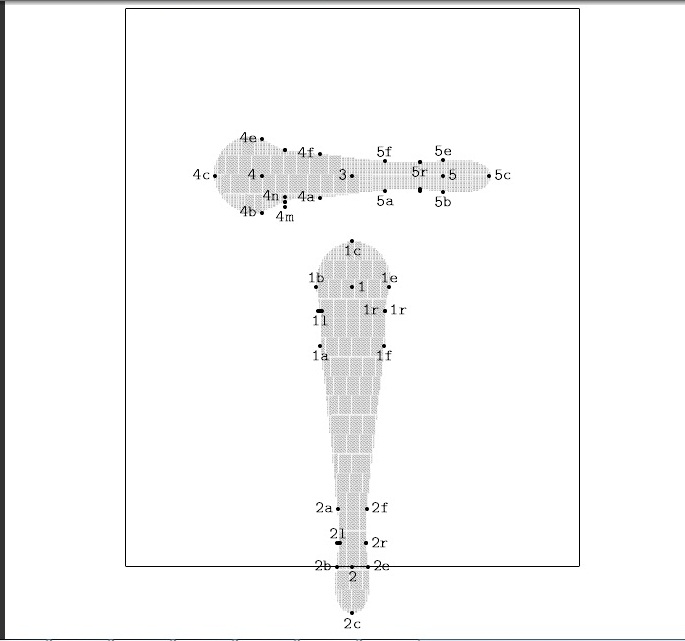
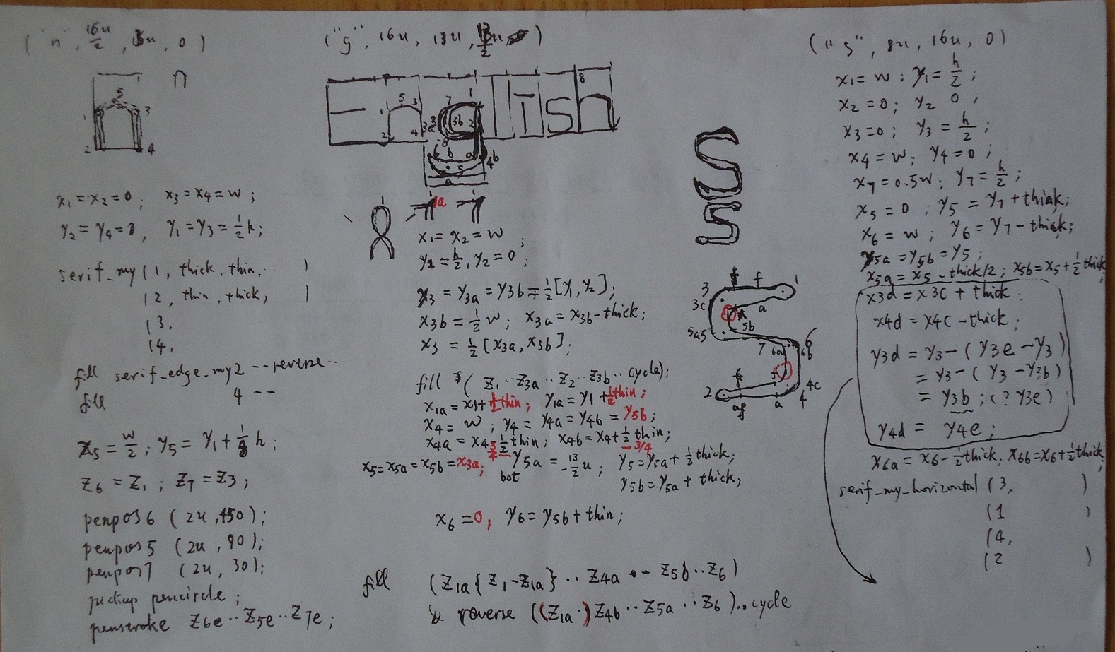
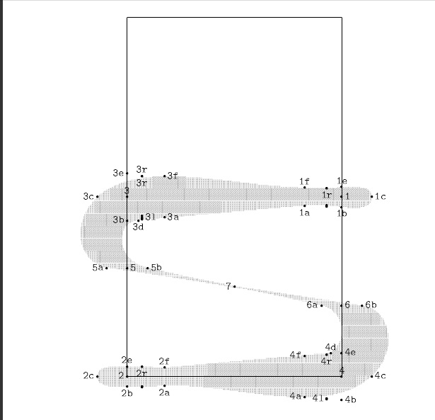
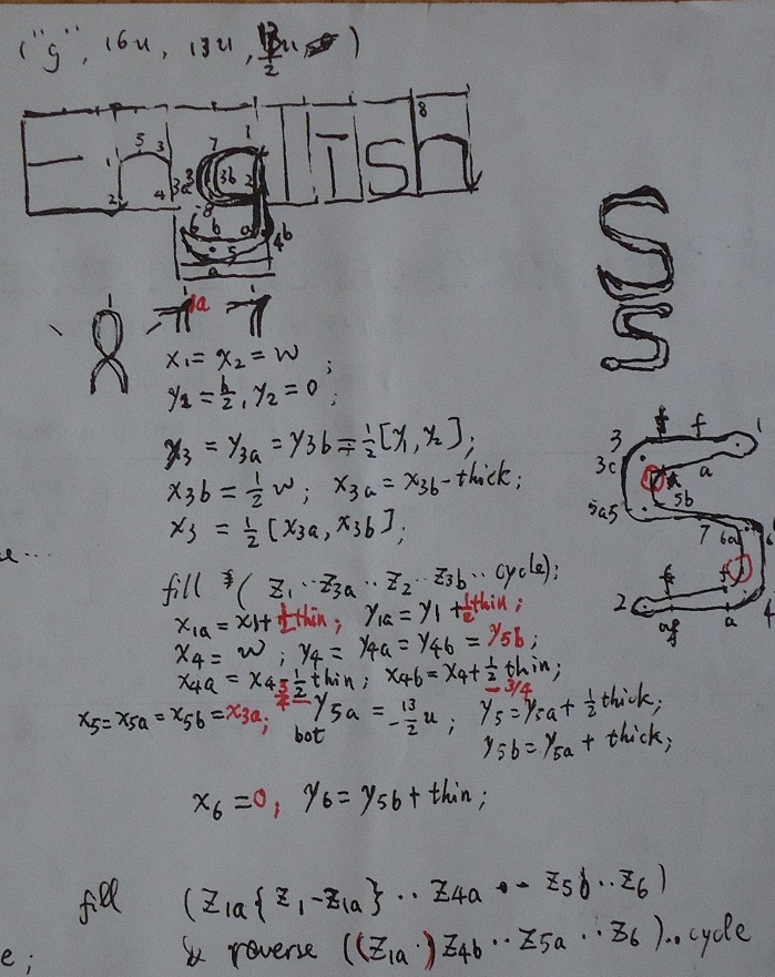
All of the other letters 'E','n','h','s' used the routines above for drawing serifs. Among them only the code for 's' is a bit complex. The draft for setting points on the outline of its glyph and programming is as the right side of the picture below:
The proof mode picture of the actual implementation of letter 's' is
The implementation code is as below:
tmp8\liS.mf:
It can be seen in the code that actually the macro serif_my has not been used here. It is just because it was copied from somewhere
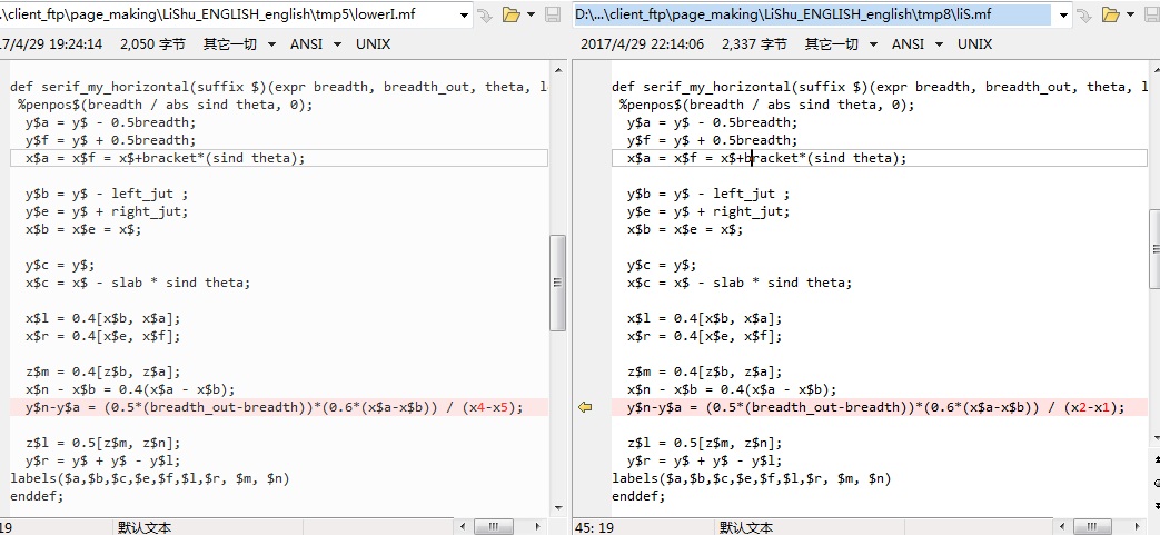
else and was left undeleted. The code of macro serif_my_horizontal is basically the same as before, with the only modification
of two points which got their x coordinates subtracted. Thus the complete reuse of the code is not achieved. The modification of this macro
compared to that used in letter 'i' is as below:
u#:=.6pt#;
thin#:=.5pt#;
thick#:=1.1pt#;
%thin#:=1pt#;
%thick#:=2.2pt#;
ht#:=7pt#;
%slab#:=.25pt#;
slab#:=.8pt#;
%jut#:=.9pt#;
jut#:=.3pt#;
%jut#:=.6pt#;
bracket#:=pt#;
define_pixels(u, ht, slab, jut, bracket);
define_blacker_pixels(thin, thick);

def serif_my(suffix $)(expr breadth, breadth_out, theta, left_jut, right_jut) =
 %penpos$(breadth / abs sind theta, 0);
  x$a = x$ - 0.5breadth;
  x$f = x$ + 0.5breadth;
  y$a = y$f = y$+bracket*(sind theta);

  x$b = x$ - left_jut ;
  x$e = x$ + right_jut;
  y$b = y$e = y$;

  x$c = x$;
  y$c = y$ - slab * sind theta;

  y$l = 0.4[y$b, y$a];
  y$r = 0.4[y$e, y$f];

  z$m = 0.4[z$b, z$a];
  y$n - y$b = 0.4(y$a - y$b);
  x$n-x$a = (0.5*(breadth_out-breadth))*(0.6*(y$a-y$b)) / (y1-y2);

  z$l = 0.5[z$m, z$n];
  x$r = x$ + x$ - x$l;
labels($a,$b,$c,$e,$f,$l,$r, $m, $n)
enddef;

def serif_my_horizontal(suffix $)(expr breadth, breadth_out, theta, left_jut, right_jut) =
 %penpos$(breadth / abs sind theta, 0);
  y$a = y$ - 0.5breadth;
  y$f = y$ + 0.5breadth;
  x$a = x$f = x$+bracket*(sind theta);

  y$b = y$ - left_jut ;
  y$e = y$ + right_jut;
  x$b = x$e = x$;

  y$c = y$;
  x$c = x$ - slab * sind theta;

  x$l = 0.4[x$b, x$a];
  x$r = 0.4[x$e, x$f];

  z$m = 0.4[z$b, z$a];
  x$n - x$b = 0.4(x$a - x$b);
  y$n-y$a = (0.5*(breadth_out-breadth))*(0.6*(x$a-x$b)) / (x2-x1);

  z$l = 0.5[z$m, z$n];
  y$r = y$ + y$ - y$l;
labels($a,$b,$c,$e,$f,$l,$r, $m, $n)
enddef;


def serif_edge_my suffix $ =
  (z$a{z$l-z$a}..z$l{z$b-z$l}...z$b..z$c..z$e{z$r-z$e}...z$r{z$f-z$r}..z$f)
enddef;


beginchar("S",9.6u#,16u#,0);"Letter S";

x1=w; y1=0.5h;
x2=0; y2= 0;
x3=0; y3=0.5h;
x4=w; y4= 0;
x7=0.5w; y7=0.5[y1,y2];
x5=0; y5=y7+thin;
x6=w; y6=y7-thin;
y5a=y5b=y5;
y6a=y6b=y6;
x5a=x5-0.5thick;
x5b=x5+0.5thick;
x6a=x6-0.5thick;
x6b=x6+0.5thick;

serif_my_horizontal(3, thick,thin,   90, 2.1jut, 2.1jut);
serif_my_horizontal(1, thin, thick, -90, 0.9jut, 0.9jut);
serif_my_horizontal(4, thick,thin,   -90, 2.1jut, 2.1jut);
serif_my_horizontal(2, thin, thick,   90, 0.9jut, 0.9jut);

x3d=x3c + thick;
x4d=x4c - thick;
y3d=y3b;
y4d=y4e;

fill serif_edge_my1 ..z3f..z3c..z5a..controls z7..z6a..z4d--reverse serif_edge_my2..z4a..z4c..z6b..controls z7..z5b..z3d{z1a-z3d}--z1a..cycle;
penlabels(1,2,3,3d, 4,4d,5,5a,5b,6,6a,6b,7);
endchar;
end
The code for letter 'E' also used the macro serif_my_horizontal, and also this macro got similar minor modifications being compared to the above one. As illustrated below, it exchanged the x1, x2 in a subtraction:
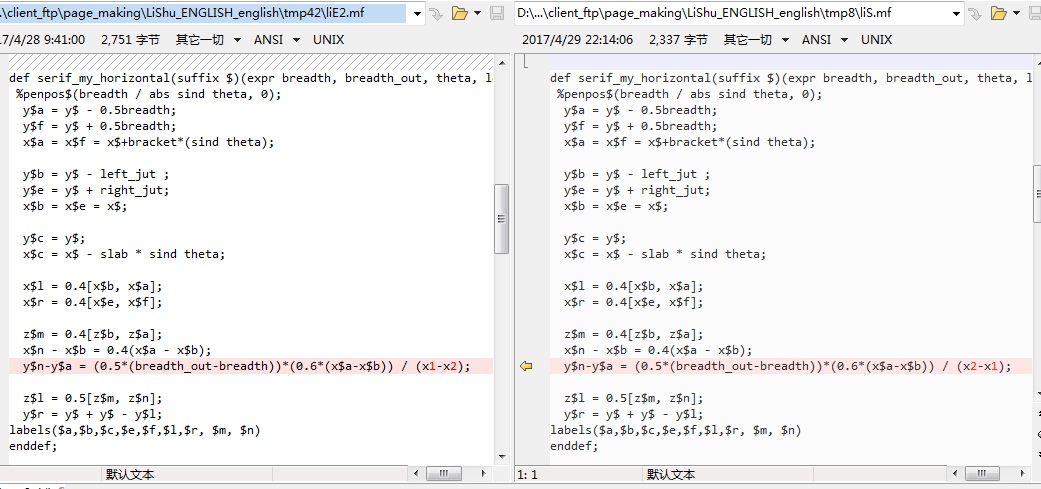
The proof mode picture of the actual implementation of letter 'E' is

The implementation code is as below:
tmp42\liE2.mf:
It can be seen I used the serif_my_horizontal routine at point 1,2,3,4,5 same as the above. Only at point 6 the points for
sketching are set seperately and here it is the place that embodies the clerical script style most in letter 'E'. There isn't any
fixed rule being used here, I just tried adjusting the setting and then checking many times and stopped modifying when the visual effect
became acceptable.
u#:=.6pt#;
thin#:=.5pt#;
thick#:=1.1pt#;
%thin#:=1pt#;
%thick#:=2.2pt#;
ht#:=7pt#;
%slab#:=.25pt#;
slab#:=.8pt#;
%jut#:=.9pt#;
jut#:=.3pt#;
%jut#:=.6pt#;
bracket#:=pt#;
define_pixels(u, ht, slab, jut, bracket);
define_blacker_pixels(thin, thick);

def serif_my_horizontal(suffix $)(expr breadth, breadth_out, theta, left_jut, right_jut) =
 %penpos$(breadth / abs sind theta, 0);
  y$a = y$ - 0.5breadth;
  y$f = y$ + 0.5breadth;
  x$a = x$f = x$+bracket*(sind theta);

  y$b = y$ - left_jut ;
  y$e = y$ + right_jut;
  x$b = x$e = x$;

  y$c = y$;
  x$c = x$ - slab * sind theta;

  x$l = 0.4[x$b, x$a];
  x$r = 0.4[x$e, x$f];

  z$m = 0.4[z$b, z$a];
  x$n - x$b = 0.4(x$a - x$b);
  y$n-y$a = (0.5*(breadth_out-breadth))*(0.6*(x$a-x$b)) / (x1-x2);

  z$l = 0.5[z$m, z$n];
  y$r = y$ + y$ - y$l;
labels($a,$b,$c,$e,$f,$l,$r, $m, $n)
enddef;


def serif_edge_my suffix $ =
  (z$a{z$l-z$a}..z$l{z$b-z$l}...z$b..z$c..z$e{z$r-z$e}...z$r{z$f-z$r}..z$f)
enddef;

beginchar("E",13u#,16u#,0);"Letter E";

x1=0; x2=.9w;
y1=h;y2=h;

x3=0+slab; x4=.7w;
y3=h/2;y4=h/2;

x5=0;
y5=0;

z7 = z1;
z8 = z5;

serif_my_horizontal(1, thick,thin,  90, 2.1jut, 2.1jut);
serif_my_horizontal(2, thin, thick, -90, 0.9jut, 0.9jut);
fill serif_edge_my2 -- reverse serif_edge_my1 -- cycle;

serif_my_horizontal(3, thick,thin,  90, 2.1jut, 2.1jut);
serif_my_horizontal(4, thin, thick, -90, 0.9jut, 0.9jut);
fill serif_edge_my4 -- reverse serif_edge_my3 -- cycle;

x6 = w;
y6 = 0;
x6a = x6f = (1/2)[x5,x6];
y6a = y5; y6f = y6a + thin;
x6b = x6-slab;  y6b = y5b - thin/3; %y6b = y6  - thick/2;
x6c = x6 + slab; y6c = y6 + thin;
x6e = x6 - 0.5*slab; y6e = y6;
serif_my_horizontal(5, thick,thin,  90, 2.1jut, 2.1jut);
fill reverse ( z5l{z5b-z5l}...z5b..z5c..z5e{z5r-z5e}...z5r{z5f-z5r})..z6a..z6b..z6c -- cycle;


penpos7(2u, 0);
penpos8(2u, 0);
pickup pencircle;
penstroke z7e--z8e;

penlabels(1,2,5,5a,5b,5c,5d,5e,6, 6a, 6b, 6c, 6e, 6f);
endchar;
end
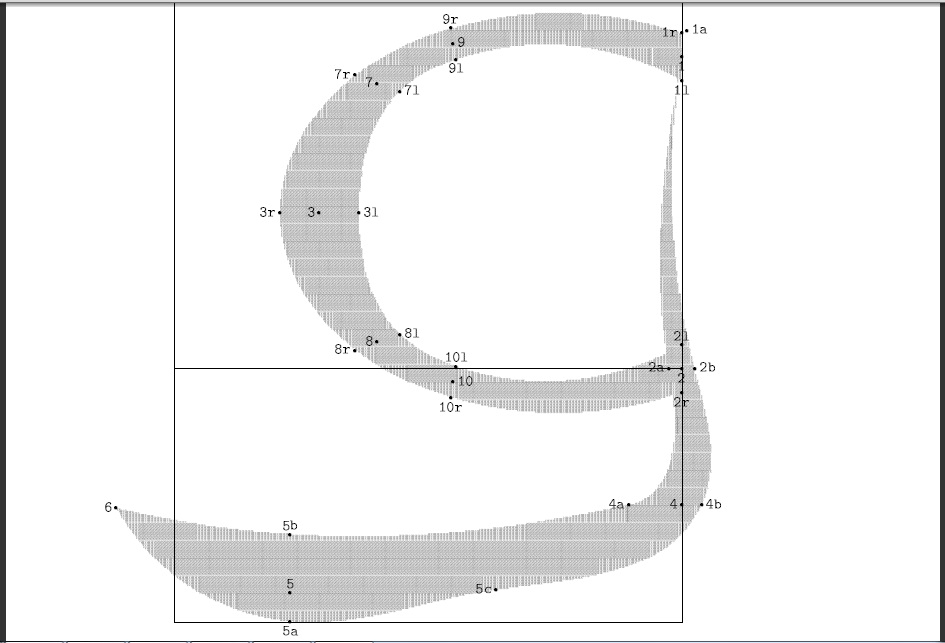
Another place that embodies the clerical script style most is in letter 'g'. The beginning draft for design is in the below picture:
The proof mode picture of the actual implementation of letter 'g' is
The implementation code of letter 'g' didn't use the routines above for serifs. It used the method like that was used in the above
'beta' example(penstroke), and still the method of outline-filling.
The code is as below:
tmp7\liG.mf:
The settings of the points 4,5,6 for sketching the outline(including control points) were still decided by adjusting and trying
many times.
u#:=.6pt#;
thin#:=.5pt#;
thick#:=1.1pt#;
%thin#:=1pt#;
%thick#:=2.2pt#;
ht#:=7pt#;
%slab#:=.25pt#;
slab#:=.8pt#;
%jut#:=.9pt#;
jut#:=.3pt#;
%jut#:=.6pt#;
bracket#:=pt#;
define_pixels(u, ht, slab, jut, bracket);
define_blacker_pixels(thin, thick);


beginchar("G",16u#,16u#,8u#);"Letter G";

x1=x2=w;
y1=0.5*h + thick; y2 = 0;

y3=0.5[y1,y2];
x3=0.4w-thick;

x7=0.4w-0.5thin;y7=y1-thin;
x8=x7;  y8=y2+thin;

x9 = 0.25[x7,x1]; x10 = x9;
y9=y1+.5thin;
y10=y2-.5thin;

penpos1(1.5u, 90);
penpos9(1u, 100);
penpos7(1.6u, 160);
penpos3(2.5u,  180);
penpos8(1.6u, 200);
penpos10(1u, 260);
penpos2(1.5u, 270);
pickup pencircle;
penstroke z1e..z9e..z7e..z3e..z8e..z10e..z2e;


x1a = x1 + .2thin;    y1a = y1 + thin;
x4 = w;  x4a = x4 - 2thin;  x4b = x4 + .75thin;
bot y5a = -8u; y5 = y5a + .5thick;  y5b = y5 + thick;
y4 = y4a = y4b = y5b + .5thick;
x5 = x5a = x5b = x3  - .5thick;
z5c = 0.5[z5a, z4b] + (0, -thin);
x6 = 0-thick; y6 = y5b + thin;

x2a = x2 - .5thin; x2b = x2 + .5thin; y2a = y2b = y2;

fill (z1a{z1-z1a}..z2a..z4a{z5-z4}..z5b..z6) & reverse (z1a..z2b..z4b..z5c..z5a..z6) ..cycle;

penlabels(1,2,3, 4,5, 6, 7, 8, 9, 10, 1a, 2a,2b, 4a,4b, 5a,5b,5c);
endchar;
end
Thus the design of the glyphs of the several letters in "English" are basically completed. The effect is that one saw in the index page of this site's web log.
The left work is the making and overlapping of some background images. I didn't use those powerful software tools as Photoshop or GIMP. And I didn't use any online software tools, either. I got it done only using Windows "mspaint", ACDSee and Microsoft Office(Powerpoint and Word). The transparency of the background images were adjusted using PowerPoint. The peculiar effects as the slanting text and halation were achieved through ACDSee. The text characters of the original style were copied from the books The @\TeX@book and The METAFONTbook. The background Chinese calligraphy originated from the excellent works in one book after one calligraphy competition and here I must express my thanks for them. The texts of some commonly seen fonts were made by Microsoft Word. Lots of processing like the overlapping and jointing etc. were accomplished by Windows "mspaint".
The main parts of the index page were finished till now. One should appreciate the powerful function of METAFONT and @\TeX@. The latex and mf program used above are those installed versions on RedHat 9.
The source package is here: LiShu_ENGLISH_english.tgz

